Timothy James Standring, curator emeritus of the Denver Art Museum noted for more than 18 exhibitions, most notably "Becoming Van Gogh" presented a series of watercolor paintings tracing the path of JMW Turner's time in the cantons of Switzerland.
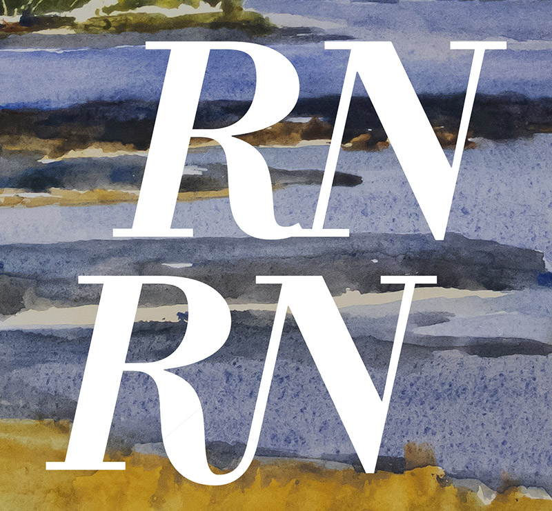
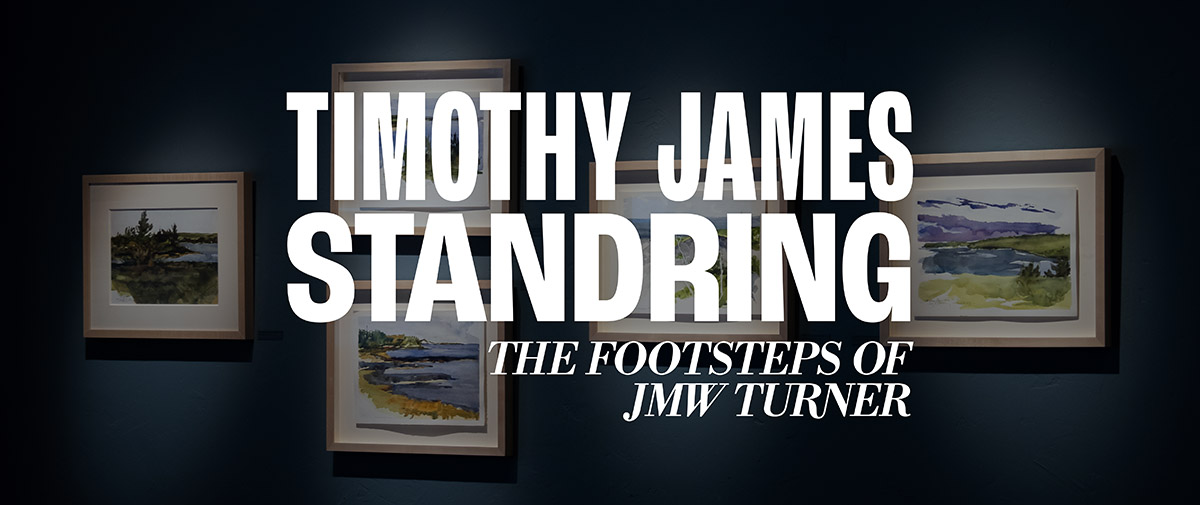
Given the shear number of characters in the overall name of the show, I wanted the word mark to be relatively simple. I opted for the house font of the gallery, Roc Grotek, paired with Libre Bodoni in italic to convey the elegance of Standring's work. Overall a lot of serifs were connected and the relationship between R and N was a little rough, so I made a custom ligature.
All of Standring's small but mighty works were painted on location. While most of them featured Switzerland and present day France, several other locations from Standring's portfolio were included as well. These pieces were organized by location, allowing viewers to travel through the various areas both in-person and digitally.
Special consideration was taken while photographing the collection to avoid any possible glare or reflections.
Scroll

Framed pieces were presented individually in the digital exhibition, while unframed works were collected in a slideshow gallery.
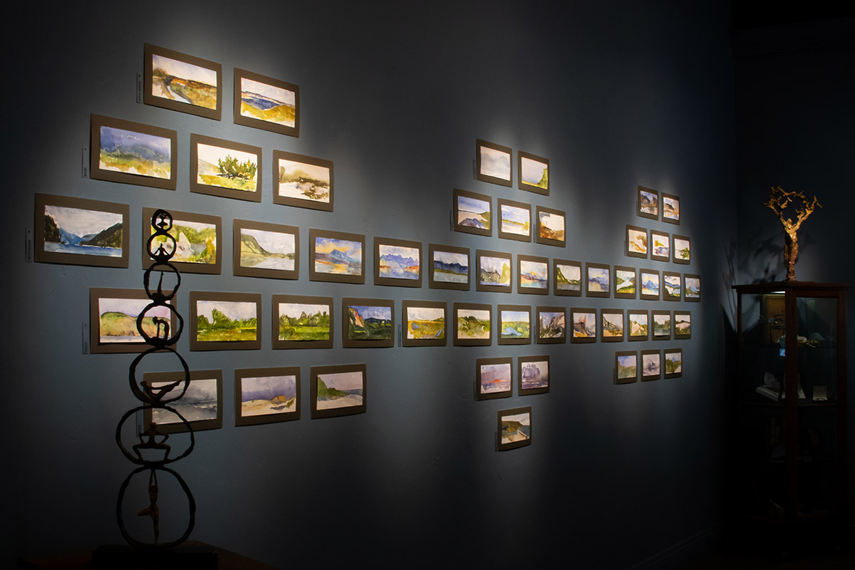
Unframed works were also featured in the exhibition. Organized by location and labeled to the left in rows, the pieces took visitors to locations across the globe. Digitally, these works were presented in a more simple gallery than their framed counterparts.
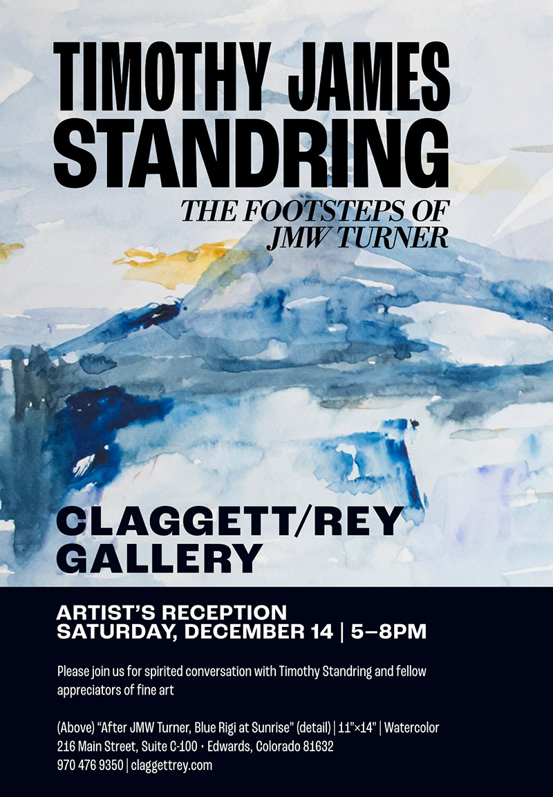
A print ad for the exhibition's artist's reception
Through both print and digital advertising, as well as general collateral for the exhibition, details of Standring's paintings were used. These snippets became almost abstract and offered stark contrast to the word mark and otherwise clean presentation of the show.
Scroll
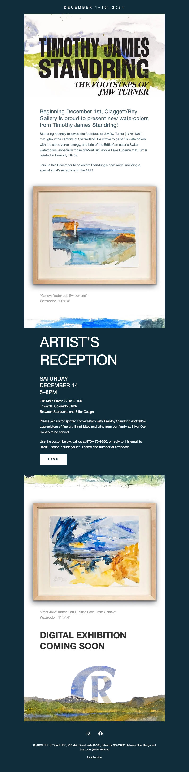
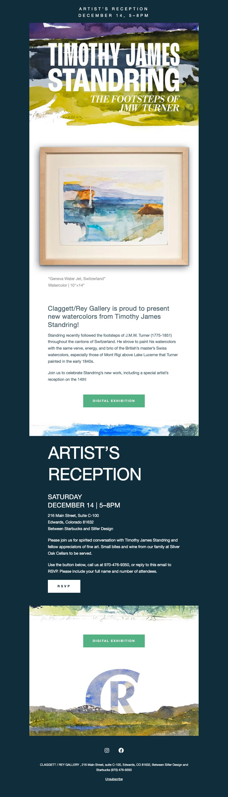
Promotional emails were sent consistently to clients and followers of the gallery, as well as social media posts to promote the exhibition.
Scroll