
GRANDEUR was a special exhibition celebrating renowned oil painter Josh Elliott. The show featured five new, larger-than-life landscape paintings.
After researching Josh and his work, it was clear that a clean, fresh aesthetic would complement the exhibition. While beautiful and lush, the works are also so deliberatly and carefully considered from a design perspective that they lend themselves naturally to a bold approach.
I hand lettered an exaggerated geometric wordmark for the exhibition to reflect the scale of the pieces involved. The wordmark allowed for some fun animation and dynamic resizing when needed.
Typically, to allow the work to shine, you kind of want to use neutral colors all around. Well, Josh’s work was so strong and the show’s entire ethos was “go big or go home,” so I decided on a booming, punchy orange throughout all materials. It complimented Josh’s work and really stood out from the crowd, especially in print media.

A print ad for the exhibition. The wordmark was fun to adapt to various shapes and sizes for different uses.
I opted for a good amount of motion graphics for the exhibition promo, announcing the show with the above video on social media.
Coordinating Instagram story announcement for the show.
Scroll
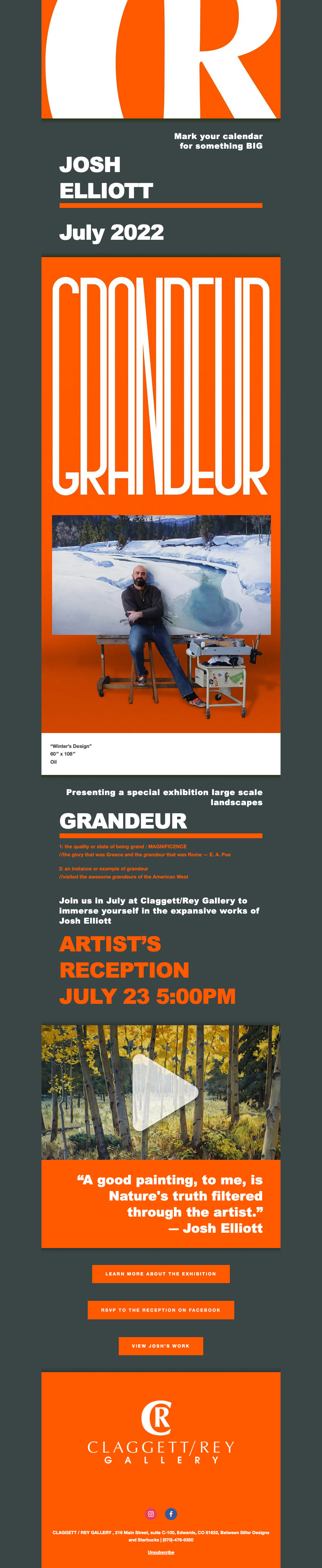
The announcement email sent to clients of the gallery.

Nationally circulated advertising
Social media announcements were made each time a piece was sold.

Local advertising featured in the highly circulated Vail Daily newspaper.
Promotional efforts ranged from small, local newspaper advertising to national publications. Supporting the efforts of traditional advertising involved email marketing and a steady stream of content across social media.
Special consideration was given to the nature of the show and its location. The Vail Daily, the newspaper of Eagle County, Colorado, publishes a 15,000-circulation, free distribution newspaper seven days a week becoming an important resource to promote the exhibition.
Even today, when the newspaper works, it works. Turnout to not just the month-long show, but the celebratory artist's reception was an incredible success leading to the sale of not only pieces featured in the exhibition, but others by Elliott as well.

Sorry if you missed it, it was a lot of fun!